In it, I will choose an especial favorite from my flickr favorites and analyze why I like it so much. These will never be quilts of my own making; I will always identify the maker's flickr name and name they have given their quilt. I hope the makers might be flattered that I have chosen their quilt to write about or at least not mind that I do so. If I include your quilt here and you do not wish it to be, please just let me know and I will remove it. I also hope that others will enjoy reading about these quilts and my exploration of what about them pleases me. But I have to admit that my main reason for doing this is selfish: I hope by really thinking about these quilts that I look at again and again and trying to understand why I love them, it might make me a better quilter.
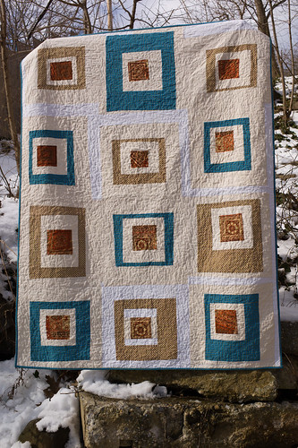
First in this series is "Wonky Squares" by SilaiBunai.

I think this quilt is like a haiku! It says so much with an economy of color and piecing.
There are only five fabrics and they have all been re-purposed from other household uses. I would love to be able to examine it closely to see the fabrics that were clothing in their previous lives: Lungi and Salwar-Kameez! The calming palette of shades of brown and cadet blue make for a serene quilt while the wonkiness of the squares give it just a bit of an edge. This quilter has a good eye for combining colors and real ability for improvisation piecing. I like the broad bands of color around the chocolate-y brown print (I tend towards thinner, fussier bands). It looks to have been machine-quilted with an over-all meandering stitch that just brings the whole thing together.
(The setting for the photo perfectly suits the quilt too!)
The challenge I take away from SilaiBunai's quilt is to do more with less and to experiment with intuitive piecing and to use wider strips. The quilt shows that one does not need the latest line from the top designers to make something amazing. All she needs is vision!
Find this and future "I LOVE this quilt!" quilts in my flickr gallery.

2 comments:
I'm very flattered! I think it's the first most comprehensive analysis of one of my quilts. You reminded me that I should take before and after pics of any upcycled quilts I make. I'll keep that in mind next time.
Looking forward to seeing more!
I'm looking forward to seeing your favourite quilts as a regular feature. Such a great idea! This first one is a great choice to start with. It's really just perfect, the right colours/shapes just where they should be.
Post a Comment